How we brought the Maid of Bruton to life for Art Farm and Durslade Vineyard
Barlow & Co. created the design ‘Maid of Bruton’ for the very first wine from Durslade Vineyard in Bruton, Somerset.
Durslade Vineyard sits on the Hauer & Wirth estate in Bruton, located next to the River Brue on the site of an ancient Roman vine terrace where a Roman coin was found by the son of Manuela Wirth.
By 2024, the vines had come into full production and the range was expanded to encompass both sparkling and still wines, so the brand was re-worked to continue the story of the vineyard and its iconic surroundings.
16,300 bottles
The 2022 vintage, released in 2024, was a bumper year with an expected yield of 16,300 bottles.
The roman coin is inscribed with a woman holding a cornucopia of grapes. The ‘Maid of Bruton’ as she has now become known is an icon of the place and its rich history.
The new branding for Durslade Vineyard, that appears on the bespoke cork, is crafted to echo the roman coin found in the vineyards.
The characters are typeset in Albertus, a timeless display font that was designed in Britain to evoke letters carved into metal.
The original roman coin has been used as the foundation for the Durslade Vineyard ‘DV’ seal of authenticity that appears on each bottle and features the original roman illustration.
The roman coin was inspiration for the Durslade Vineyard branding and the ‘Maid of Bruton’ name.
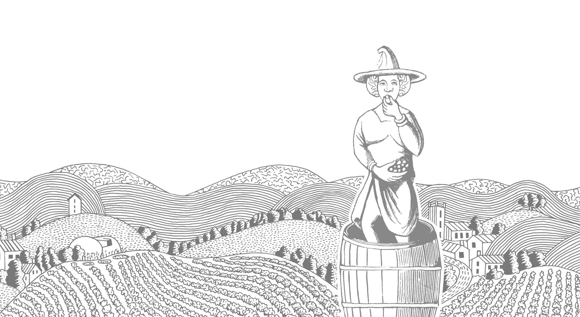
The Maid of Bruton wine label design features a characterful medieval interpretation of our maid treading and eating grapes with a mischievous look in her eye.
In the background, a new illustration shows Durslade Vineyards with the rolling Somerset hills around Bruton.
The illustrated landscape literally ‘wraps’ around the bottle to evoke the scenery of Bruton, and features landmarks and details unique to the area, including the Hauser & Wirth gardens, the River Brue, St. Marys’ Church and the iconic Bruton Dovecote.
The labels are printed in one colour on a cotton textured uncoated paper. The bottles are finished with a brightly coloured wax seal that complements the flavour characteristics of each wine and removes unneccessary metal or plastic closures.
Combing authentic and historical elements, in a timeless but eye-catching label design, every element of the design has been considered to help tell the story of ‘Maid of Bruton’. From the vineyards, a stone’s throw from ancient roman terraces, to the rich history of Bruton and the grapes that are pressed and fermented just five miles away, these new wines are a celebration of Bruton wine and its winemaking provenance.
What we did
— Creative label concepts
— Bespoke illustration
— Artwork and production
More case studies


